> ## Documentation Index
> Fetch the complete documentation index at: https://tif1.tracinginsights.com/llms.txt
> Use this file to discover all available pages before exploring further.
# Lap Time Delta Comparison
> Compare lap-by-lap performance between two drivers
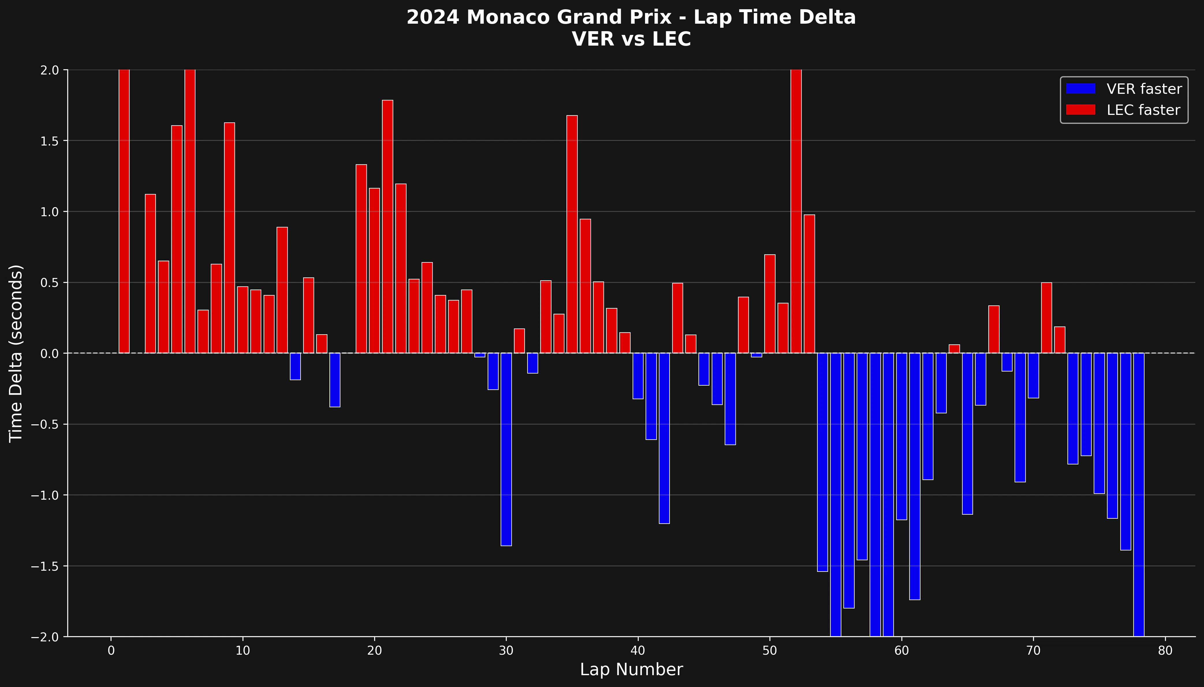
This tutorial shows how to create a lap-by-lap delta comparison between two drivers. The visualization reveals who was faster on each lap and by how much, making it easy to spot performance trends throughout a race.
 ## Setup
```python theme={"theme":{"light":"github-light","dark":"github-dark"}}
import tif1
from tif1.plotting import get_team_color, setup_mpl
import matplotlib.pyplot as plt
# Setup plotting
setup_mpl(color_scheme='fastf1')
```
## Load Session and Get Lap Data
```python theme={"theme":{"light":"github-light","dark":"github-dark"}}
# Load the race session
session = tif1.get_session(2024, "Monaco", "R")
laps = session.laps
# Select two drivers to compare
driver1 = "VER"
driver2 = "LEC"
# Get laps for both drivers
driver1_laps = laps[laps["Driver"] == driver1][["LapNumber", "LapTime"]].copy()
driver2_laps = laps[laps["Driver"] == driver2][["LapNumber", "LapTime"]].copy()
```
## Calculate Time Deltas
Convert lap times to seconds and calculate the difference for each lap.
```python theme={"theme":{"light":"github-light","dark":"github-dark"}}
# Convert lap times to seconds
driver1_laps["LapTime"] = driver1_laps["LapTime"].dt.total_seconds()
driver2_laps["LapTime"] = driver2_laps["LapTime"].dt.total_seconds()
# Merge on lap number to compare
merged = driver1_laps.merge(
driver2_laps,
on="LapNumber",
suffixes=("_d1", "_d2")
)
# Calculate delta (positive = driver2 faster, negative = driver1 faster)
merged["Delta"] = merged["LapTime_d1"] - merged["LapTime_d2"]
```
## Color Code by Faster Driver
Assign colors based on which driver was faster on each lap.
```python theme={"theme":{"light":"github-light","dark":"github-dark"}}
# Color based on who was faster
merged["Color"] = merged["Delta"].apply(
lambda x: get_team_color("Red Bull Racing") if x < 0
else get_team_color("Ferrari")
)
```
## Create the Bar Chart
Visualize the deltas with a bar chart where bar height shows the time difference.
```python theme={"theme":{"light":"github-light","dark":"github-dark"}}
fig, ax = plt.subplots(figsize=(14, 8))
# Bar chart of deltas
ax.bar(
merged["LapNumber"],
merged["Delta"],
color=merged["Color"],
width=0.8,
edgecolor="white",
linewidth=0.5,
)
# Add zero line for reference
ax.axhline(0, color="white", linestyle="--", linewidth=1, alpha=0.7)
# Labels and title
ax.set_xlabel("Lap Number", fontsize=14)
ax.set_ylabel("Time Delta (seconds)", fontsize=14)
ax.set_title(
f"{session.event.year} {session.event['EventName']} - Lap Time Delta\n"
f"{driver1} vs {driver2}",
fontsize=16,
fontweight="bold",
pad=20,
)
```
## Add Legend and Styling
```python theme={"theme":{"light":"github-light","dark":"github-dark"}}
from matplotlib.patches import Patch
# Create legend
legend_elements = [
Patch(facecolor=get_team_color("Red Bull Racing"), label=f"{driver1} faster"),
Patch(facecolor=get_team_color("Ferrari"), label=f"{driver2} faster"),
]
ax.legend(handles=legend_elements, loc="upper right", fontsize=12)
# Add grid and clean up
ax.grid(True, alpha=0.3, axis="y")
ax.set_ylim(-2, 2)
ax.spines["top"].set_visible(False)
ax.spines["right"].set_visible(False)
plt.tight_layout()
plt.show()
```
## Complete Example
Here's the full code in one block:
```python theme={"theme":{"light":"github-light","dark":"github-dark"}}
import matplotlib.pyplot as plt
import tif1
from tif1.plotting import get_team_color, setup_mpl
from matplotlib.patches import Patch
# Setup plotting
setup_mpl(color_scheme="fastf1")
# Load session
session = tif1.get_session(2024, "Monaco", "R")
laps = session.laps
# Select drivers
driver1 = "VER"
driver2 = "LEC"
# Get and prepare lap data
driver1_laps = laps[laps["Driver"] == driver1][["LapNumber", "LapTime"]].copy()
driver2_laps = laps[laps["Driver"] == driver2][["LapNumber", "LapTime"]].copy()
driver1_laps["LapTime"] = driver1_laps["LapTime"].dt.total_seconds()
driver2_laps["LapTime"] = driver2_laps["LapTime"].dt.total_seconds()
# Merge and calculate delta
merged = driver1_laps.merge(driver2_laps, on="LapNumber", suffixes=("_d1", "_d2"))
merged["Delta"] = merged["LapTime_d1"] - merged["LapTime_d2"]
merged["Color"] = merged["Delta"].apply(
lambda x: get_team_color("Red Bull Racing") if x < 0
else get_team_color("Ferrari")
)
# Create plot
fig, ax = plt.subplots(figsize=(14, 8))
ax.bar(
merged["LapNumber"],
merged["Delta"],
color=merged["Color"],
width=0.8,
edgecolor="white",
linewidth=0.5,
)
ax.axhline(0, color="white", linestyle="--", linewidth=1, alpha=0.7)
ax.set_xlabel("Lap Number", fontsize=14)
ax.set_ylabel("Time Delta (seconds)", fontsize=14)
ax.set_title(
f"{session.event.year} {session.event['EventName']} - Lap Time Delta\n"
f"{driver1} vs {driver2}",
fontsize=16,
fontweight="bold",
pad=20,
)
legend_elements = [
Patch(facecolor=get_team_color("Red Bull Racing"), label=f"{driver1} faster"),
Patch(facecolor=get_team_color("Ferrari"), label=f"{driver2} faster"),
]
ax.legend(handles=legend_elements, loc="upper right", fontsize=12)
ax.grid(True, alpha=0.3, axis="y")
ax.set_ylim(-2, 2)
ax.spines["top"].set_visible(False)
ax.spines["right"].set_visible(False)
plt.tight_layout()
plt.show()
```
## Interpreting the Chart
* **Bars above zero**: Driver 2 was faster on that lap
* **Bars below zero**: Driver 1 was faster on that lap
* **Bar height**: Magnitude of the time difference in seconds
* **Color coding**: Quick visual identification of who was faster
## What to Look For
This visualization helps identify:
1. **Consistency**: Who maintains more consistent lap times?
2. **Pace trends**: Does one driver get faster or slower as the race progresses?
3. **Tire degradation**: Increasing deltas may indicate tire wear
4. **Strategy impact**: How do pit stops affect relative performance?
5. **Traffic effects**: Sudden spikes often indicate traffic or incidents
## Filtering Out Outliers
For cleaner analysis, you can filter out pit laps and safety car periods:
```python theme={"theme":{"light":"github-light","dark":"github-dark"}}
# Remove pit laps
driver1_laps = driver1_laps[driver1_laps["PitOutTime"].isna()]
driver2_laps = driver2_laps[driver2_laps["PitOutTime"].isna()]
# Remove laps that are too slow (e.g., safety car)
threshold = 1.1 # 110% of fastest lap
driver1_fastest = driver1_laps["LapTime"].min()
driver2_fastest = driver2_laps["LapTime"].min()
driver1_laps = driver1_laps[driver1_laps["LapTime"] < driver1_fastest * threshold]
driver2_laps = driver2_laps[driver2_laps["LapTime"] < driver2_fastest * threshold]
```
## Comparing Multiple Driver Pairs
You can create a function to easily compare different driver pairs:
```python theme={"theme":{"light":"github-light","dark":"github-dark"}}
def plot_lap_delta(session, driver1, driver2):
"""Plot lap time delta comparison between two drivers."""
laps = session.laps
# Get lap data
d1_laps = laps[laps["Driver"] == driver1][["LapNumber", "LapTime"]].copy()
d2_laps = laps[laps["Driver"] == driver2][["LapNumber", "LapTime"]].copy()
# Convert to seconds
d1_laps["LapTime"] = d1_laps["LapTime"].dt.total_seconds()
d2_laps["LapTime"] = d2_laps["LapTime"].dt.total_seconds()
# Merge and calculate delta
merged = d1_laps.merge(d2_laps, on="LapNumber", suffixes=("_d1", "_d2"))
merged["Delta"] = merged["LapTime_d1"] - merged["LapTime_d2"]
# Get team colors
d1_team = laps[laps["Driver"] == driver1].iloc[0]["Team"]
d2_team = laps[laps["Driver"] == driver2].iloc[0]["Team"]
merged["Color"] = merged["Delta"].apply(
lambda x: get_team_color(d1_team) if x < 0 else get_team_color(d2_team)
)
# Plot
fig, ax = plt.subplots(figsize=(14, 8))
ax.bar(merged["LapNumber"], merged["Delta"], color=merged["Color"], width=0.8)
ax.axhline(0, color="white", linestyle="--", linewidth=1, alpha=0.7)
ax.set_xlabel("Lap Number")
ax.set_ylabel("Time Delta (seconds)")
ax.set_title(f"{driver1} vs {driver2} - Lap Time Delta")
ax.grid(True, alpha=0.3, axis="y")
plt.tight_layout()
plt.show()
# Use the function
plot_lap_delta(session, "VER", "LEC")
plot_lap_delta(session, "HAM", "RUS")
```
## Summary
Lap delta comparisons provide a clear, lap-by-lap view of relative performance between drivers. This simple visualization makes it easy to spot patterns, consistency differences, and the impact of race events on driver performance.
***
## Related Pages
Individual driver analysis
Detailed telemetry analysis
Compare race pace
Track position changes
## Setup
```python theme={"theme":{"light":"github-light","dark":"github-dark"}}
import tif1
from tif1.plotting import get_team_color, setup_mpl
import matplotlib.pyplot as plt
# Setup plotting
setup_mpl(color_scheme='fastf1')
```
## Load Session and Get Lap Data
```python theme={"theme":{"light":"github-light","dark":"github-dark"}}
# Load the race session
session = tif1.get_session(2024, "Monaco", "R")
laps = session.laps
# Select two drivers to compare
driver1 = "VER"
driver2 = "LEC"
# Get laps for both drivers
driver1_laps = laps[laps["Driver"] == driver1][["LapNumber", "LapTime"]].copy()
driver2_laps = laps[laps["Driver"] == driver2][["LapNumber", "LapTime"]].copy()
```
## Calculate Time Deltas
Convert lap times to seconds and calculate the difference for each lap.
```python theme={"theme":{"light":"github-light","dark":"github-dark"}}
# Convert lap times to seconds
driver1_laps["LapTime"] = driver1_laps["LapTime"].dt.total_seconds()
driver2_laps["LapTime"] = driver2_laps["LapTime"].dt.total_seconds()
# Merge on lap number to compare
merged = driver1_laps.merge(
driver2_laps,
on="LapNumber",
suffixes=("_d1", "_d2")
)
# Calculate delta (positive = driver2 faster, negative = driver1 faster)
merged["Delta"] = merged["LapTime_d1"] - merged["LapTime_d2"]
```
## Color Code by Faster Driver
Assign colors based on which driver was faster on each lap.
```python theme={"theme":{"light":"github-light","dark":"github-dark"}}
# Color based on who was faster
merged["Color"] = merged["Delta"].apply(
lambda x: get_team_color("Red Bull Racing") if x < 0
else get_team_color("Ferrari")
)
```
## Create the Bar Chart
Visualize the deltas with a bar chart where bar height shows the time difference.
```python theme={"theme":{"light":"github-light","dark":"github-dark"}}
fig, ax = plt.subplots(figsize=(14, 8))
# Bar chart of deltas
ax.bar(
merged["LapNumber"],
merged["Delta"],
color=merged["Color"],
width=0.8,
edgecolor="white",
linewidth=0.5,
)
# Add zero line for reference
ax.axhline(0, color="white", linestyle="--", linewidth=1, alpha=0.7)
# Labels and title
ax.set_xlabel("Lap Number", fontsize=14)
ax.set_ylabel("Time Delta (seconds)", fontsize=14)
ax.set_title(
f"{session.event.year} {session.event['EventName']} - Lap Time Delta\n"
f"{driver1} vs {driver2}",
fontsize=16,
fontweight="bold",
pad=20,
)
```
## Add Legend and Styling
```python theme={"theme":{"light":"github-light","dark":"github-dark"}}
from matplotlib.patches import Patch
# Create legend
legend_elements = [
Patch(facecolor=get_team_color("Red Bull Racing"), label=f"{driver1} faster"),
Patch(facecolor=get_team_color("Ferrari"), label=f"{driver2} faster"),
]
ax.legend(handles=legend_elements, loc="upper right", fontsize=12)
# Add grid and clean up
ax.grid(True, alpha=0.3, axis="y")
ax.set_ylim(-2, 2)
ax.spines["top"].set_visible(False)
ax.spines["right"].set_visible(False)
plt.tight_layout()
plt.show()
```
## Complete Example
Here's the full code in one block:
```python theme={"theme":{"light":"github-light","dark":"github-dark"}}
import matplotlib.pyplot as plt
import tif1
from tif1.plotting import get_team_color, setup_mpl
from matplotlib.patches import Patch
# Setup plotting
setup_mpl(color_scheme="fastf1")
# Load session
session = tif1.get_session(2024, "Monaco", "R")
laps = session.laps
# Select drivers
driver1 = "VER"
driver2 = "LEC"
# Get and prepare lap data
driver1_laps = laps[laps["Driver"] == driver1][["LapNumber", "LapTime"]].copy()
driver2_laps = laps[laps["Driver"] == driver2][["LapNumber", "LapTime"]].copy()
driver1_laps["LapTime"] = driver1_laps["LapTime"].dt.total_seconds()
driver2_laps["LapTime"] = driver2_laps["LapTime"].dt.total_seconds()
# Merge and calculate delta
merged = driver1_laps.merge(driver2_laps, on="LapNumber", suffixes=("_d1", "_d2"))
merged["Delta"] = merged["LapTime_d1"] - merged["LapTime_d2"]
merged["Color"] = merged["Delta"].apply(
lambda x: get_team_color("Red Bull Racing") if x < 0
else get_team_color("Ferrari")
)
# Create plot
fig, ax = plt.subplots(figsize=(14, 8))
ax.bar(
merged["LapNumber"],
merged["Delta"],
color=merged["Color"],
width=0.8,
edgecolor="white",
linewidth=0.5,
)
ax.axhline(0, color="white", linestyle="--", linewidth=1, alpha=0.7)
ax.set_xlabel("Lap Number", fontsize=14)
ax.set_ylabel("Time Delta (seconds)", fontsize=14)
ax.set_title(
f"{session.event.year} {session.event['EventName']} - Lap Time Delta\n"
f"{driver1} vs {driver2}",
fontsize=16,
fontweight="bold",
pad=20,
)
legend_elements = [
Patch(facecolor=get_team_color("Red Bull Racing"), label=f"{driver1} faster"),
Patch(facecolor=get_team_color("Ferrari"), label=f"{driver2} faster"),
]
ax.legend(handles=legend_elements, loc="upper right", fontsize=12)
ax.grid(True, alpha=0.3, axis="y")
ax.set_ylim(-2, 2)
ax.spines["top"].set_visible(False)
ax.spines["right"].set_visible(False)
plt.tight_layout()
plt.show()
```
## Interpreting the Chart
* **Bars above zero**: Driver 2 was faster on that lap
* **Bars below zero**: Driver 1 was faster on that lap
* **Bar height**: Magnitude of the time difference in seconds
* **Color coding**: Quick visual identification of who was faster
## What to Look For
This visualization helps identify:
1. **Consistency**: Who maintains more consistent lap times?
2. **Pace trends**: Does one driver get faster or slower as the race progresses?
3. **Tire degradation**: Increasing deltas may indicate tire wear
4. **Strategy impact**: How do pit stops affect relative performance?
5. **Traffic effects**: Sudden spikes often indicate traffic or incidents
## Filtering Out Outliers
For cleaner analysis, you can filter out pit laps and safety car periods:
```python theme={"theme":{"light":"github-light","dark":"github-dark"}}
# Remove pit laps
driver1_laps = driver1_laps[driver1_laps["PitOutTime"].isna()]
driver2_laps = driver2_laps[driver2_laps["PitOutTime"].isna()]
# Remove laps that are too slow (e.g., safety car)
threshold = 1.1 # 110% of fastest lap
driver1_fastest = driver1_laps["LapTime"].min()
driver2_fastest = driver2_laps["LapTime"].min()
driver1_laps = driver1_laps[driver1_laps["LapTime"] < driver1_fastest * threshold]
driver2_laps = driver2_laps[driver2_laps["LapTime"] < driver2_fastest * threshold]
```
## Comparing Multiple Driver Pairs
You can create a function to easily compare different driver pairs:
```python theme={"theme":{"light":"github-light","dark":"github-dark"}}
def plot_lap_delta(session, driver1, driver2):
"""Plot lap time delta comparison between two drivers."""
laps = session.laps
# Get lap data
d1_laps = laps[laps["Driver"] == driver1][["LapNumber", "LapTime"]].copy()
d2_laps = laps[laps["Driver"] == driver2][["LapNumber", "LapTime"]].copy()
# Convert to seconds
d1_laps["LapTime"] = d1_laps["LapTime"].dt.total_seconds()
d2_laps["LapTime"] = d2_laps["LapTime"].dt.total_seconds()
# Merge and calculate delta
merged = d1_laps.merge(d2_laps, on="LapNumber", suffixes=("_d1", "_d2"))
merged["Delta"] = merged["LapTime_d1"] - merged["LapTime_d2"]
# Get team colors
d1_team = laps[laps["Driver"] == driver1].iloc[0]["Team"]
d2_team = laps[laps["Driver"] == driver2].iloc[0]["Team"]
merged["Color"] = merged["Delta"].apply(
lambda x: get_team_color(d1_team) if x < 0 else get_team_color(d2_team)
)
# Plot
fig, ax = plt.subplots(figsize=(14, 8))
ax.bar(merged["LapNumber"], merged["Delta"], color=merged["Color"], width=0.8)
ax.axhline(0, color="white", linestyle="--", linewidth=1, alpha=0.7)
ax.set_xlabel("Lap Number")
ax.set_ylabel("Time Delta (seconds)")
ax.set_title(f"{driver1} vs {driver2} - Lap Time Delta")
ax.grid(True, alpha=0.3, axis="y")
plt.tight_layout()
plt.show()
# Use the function
plot_lap_delta(session, "VER", "LEC")
plot_lap_delta(session, "HAM", "RUS")
```
## Summary
Lap delta comparisons provide a clear, lap-by-lap view of relative performance between drivers. This simple visualization makes it easy to spot patterns, consistency differences, and the impact of race events on driver performance.
***
## Related Pages
Individual driver analysis
Detailed telemetry analysis
Compare race pace
Track position changes