> ## Documentation Index
> Fetch the complete documentation index at: https://tif1.tracinginsights.com/llms.txt
> Use this file to discover all available pages before exploring further.
# Qualifying Results Visualization
> Create a visual overview of qualifying results with gap to pole position
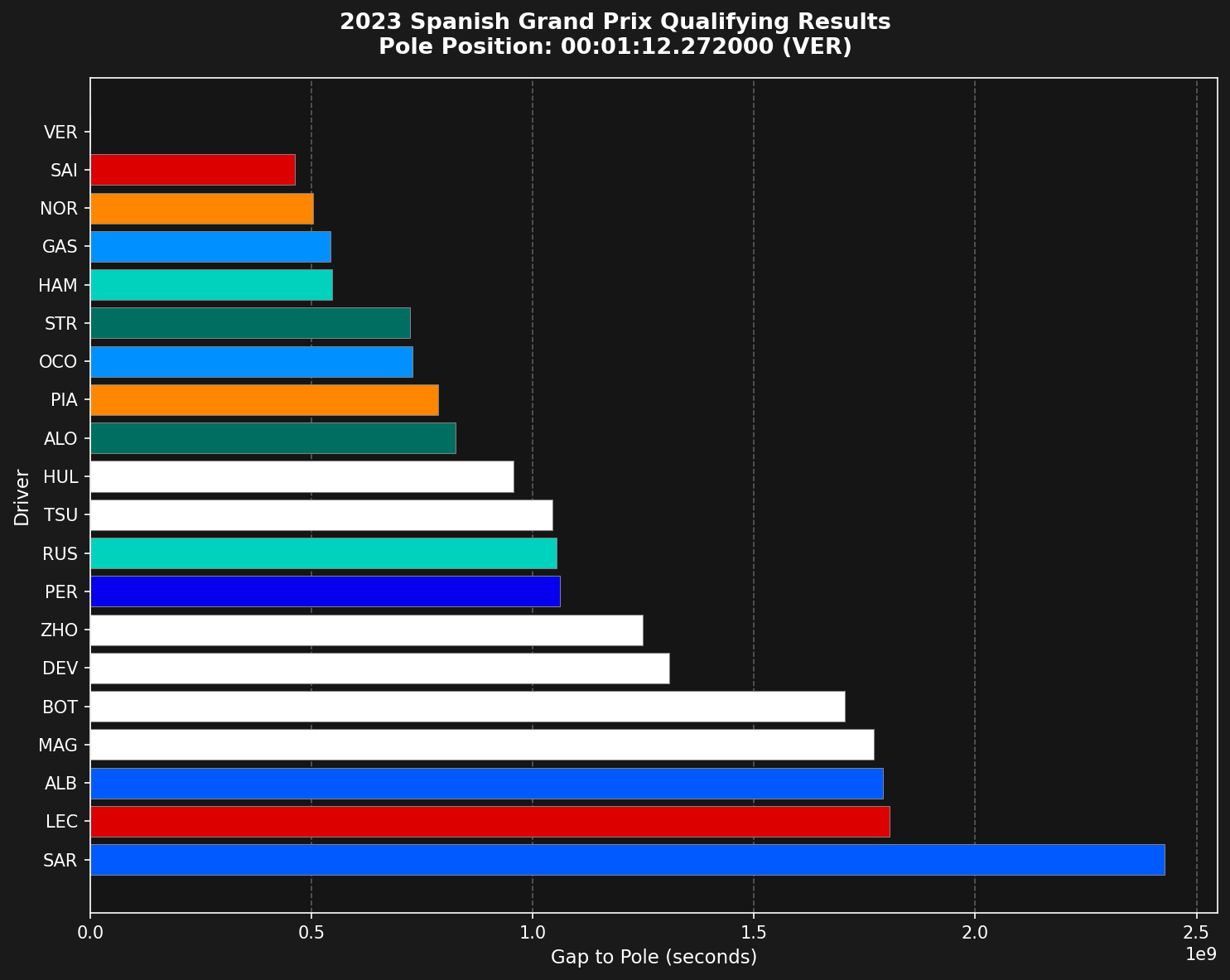
This tutorial shows you how to create a professional qualifying results chart that displays all drivers' performance relative to pole position, with team colors for easy identification.
 ## Overview
The qualifying results chart is a horizontal bar chart that shows:
* Each driver's position in qualifying order (fastest at top)
* Gap to pole position in seconds
* Team colors for visual identification
* Clear pole position reference
## Loading the data
First, load the qualifying session and get all drivers' fastest laps.
```python theme={"theme":{"light":"github-light","dark":"github-dark"}}
import tif1
import matplotlib.pyplot as plt
import pandas as pd
# Setup plotting with timedelta support
tif1.plotting.setup_mpl(mpl_timedelta_support=True, color_scheme='fastf1')
# Load qualifying session
session = tif1.get_session(2023, 'Spanish Grand Prix', 'Q')
laps = session.laps
# Get all unique drivers
drivers = pd.unique(laps['Driver'])
```
## Getting fastest laps per driver
Extract each driver's fastest lap from the session.
```python theme={"theme":{"light":"github-light","dark":"github-dark"}}
# Get fastest lap for each driver
list_fastest_laps = []
for drv in drivers:
drv_laps = laps[laps['Driver'] == drv]
if len(drv_laps) > 0:
fastest_idx = drv_laps['LapTime'].idxmin()
list_fastest_laps.append(drv_laps.loc[fastest_idx])
# Create DataFrame and sort by lap time
fastest_laps = pd.DataFrame(list_fastest_laps) \
.sort_values(by='LapTime') \
.reset_index(drop=True)
```
## Calculating gap to pole
The chart shows time differences from pole position, not absolute lap times.
```python theme={"theme":{"light":"github-light","dark":"github-dark"}}
# Calculate time delta from pole
pole_lap_time = fastest_laps['LapTime'].iloc[0]
fastest_laps['LapTimeDelta'] = fastest_laps['LapTime'] - pole_lap_time
# Preview the results
print(fastest_laps[['Driver', 'LapTime', 'LapTimeDelta']].head(10))
```
This gives you a clear view of how far each driver was from pole position.
## Getting team colors
Use tif1's built-in color mapping to get official team colors.
```python theme={"theme":{"light":"github-light","dark":"github-dark"}}
# Get team colors for each driver
team_colors = []
for _, lap in fastest_laps.iterrows():
color = tif1.plotting.get_team_color(team=lap['Team'], session=session)
team_colors.append(color)
```
## Creating the visualization
Build a horizontal bar chart with proper formatting.
```python theme={"theme":{"light":"github-light","dark":"github-dark"}}
# Create the plot
fig, ax = plt.subplots(figsize=(10, 8))
ax.barh(fastest_laps.index, fastest_laps['LapTimeDelta'],
color=team_colors, edgecolor='grey', linewidth=0.5)
# Set driver labels
ax.set_yticks(fastest_laps.index)
ax.set_yticklabels(fastest_laps['Driver'])
# Show fastest at the top
ax.invert_yaxis()
# Add grid lines
ax.set_axisbelow(True)
ax.xaxis.grid(True, which='major', linestyle='--',
color='white', alpha=0.3, zorder=-1000)
# Labels
ax.set_xlabel('Gap to Pole (seconds)', fontsize=11)
ax.set_ylabel('Driver', fontsize=11)
# Format title
pole_driver = fastest_laps['Driver'].iloc[0]
pole_time_str = str(pole_lap_time).split()[-1]
plt.suptitle(f"2023 Spanish Grand Prix Qualifying Results\n"
f"Pole Position: {pole_time_str} ({pole_driver})",
fontsize=13, fontweight='bold')
plt.tight_layout()
plt.show()
```
## Complete example
Here's the full code in one place:
```python theme={"theme":{"light":"github-light","dark":"github-dark"}}
import tif1
import matplotlib.pyplot as plt
import pandas as pd
# Setup plotting
tif1.plotting.setup_mpl(mpl_timedelta_support=True, color_scheme='fastf1')
# Load qualifying session
session = tif1.get_session(2023, 'Spanish Grand Prix', 'Q')
laps = session.laps
# Get all unique drivers
drivers = pd.unique(laps['Driver'])
# Get fastest lap for each driver
list_fastest_laps = []
for drv in drivers:
drv_laps = laps[laps['Driver'] == drv]
if len(drv_laps) > 0:
fastest_idx = drv_laps['LapTime'].idxmin()
list_fastest_laps.append(drv_laps.loc[fastest_idx])
# Create DataFrame and sort by lap time
fastest_laps = pd.DataFrame(list_fastest_laps) \
.sort_values(by='LapTime') \
.reset_index(drop=True)
# Calculate time delta from pole
pole_lap_time = fastest_laps['LapTime'].iloc[0]
fastest_laps['LapTimeDelta'] = fastest_laps['LapTime'] - pole_lap_time
# Get team colors
team_colors = []
for _, lap in fastest_laps.iterrows():
color = tif1.plotting.get_team_color(team=lap['Team'], session=session)
team_colors.append(color)
# Create the plot
fig, ax = plt.subplots(figsize=(10, 8))
ax.barh(fastest_laps.index, fastest_laps['LapTimeDelta'],
color=team_colors, edgecolor='grey', linewidth=0.5)
ax.set_yticks(fastest_laps.index)
ax.set_yticklabels(fastest_laps['Driver'])
ax.invert_yaxis()
ax.set_axisbelow(True)
ax.xaxis.grid(True, which='major', linestyle='--',
color='white', alpha=0.3, zorder=-1000)
ax.set_xlabel('Gap to Pole (seconds)', fontsize=11)
ax.set_ylabel('Driver', fontsize=11)
pole_driver = fastest_laps['Driver'].iloc[0]
pole_time_str = str(pole_lap_time).split()[-1]
plt.suptitle(f"2023 Spanish Grand Prix Qualifying Results\n"
f"Pole Position: {pole_time_str} ({pole_driver})",
fontsize=13, fontweight='bold')
plt.tight_layout()
plt.show()
```
## Customization options
Enhance the chart with additional features:
```python theme={"theme":{"light":"github-light","dark":"github-dark"}}
# Show only top 10
fastest_laps_top10 = fastest_laps.head(10)
# Add value labels on bars
for idx, (i, row) in enumerate(fastest_laps.iterrows()):
if row['LapTimeDelta'].total_seconds() > 0:
ax.text(row['LapTimeDelta'].total_seconds(), idx,
f"+{row['LapTimeDelta'].total_seconds():.3f}s",
va='center', ha='left', fontsize=9, color='white')
# Highlight specific drivers
highlight_driver = 'HAM'
for idx, row in fastest_laps.iterrows():
if row['Driver'] == highlight_driver:
ax.get_children()[idx].set_edgecolor('yellow')
ax.get_children()[idx].set_linewidth(2)
```
## Comparing multiple sessions
Create side-by-side comparisons of different qualifying sessions:
```python theme={"theme":{"light":"github-light","dark":"github-dark"}}
fig, (ax1, ax2) = plt.subplots(1, 2, figsize=(16, 8))
# Load two different qualifying sessions
session1 = tif1.get_session(2023, 'Spanish Grand Prix', 'Q')
session2 = tif1.get_session(2023, 'Monaco Grand Prix', 'Q')
# Plot both (reuse the plotting code for each axis)
# ... plotting code for ax1 and ax2 ...
plt.tight_layout()
plt.show()
```
## Exporting the chart
Save the visualization for reports or presentations:
```python theme={"theme":{"light":"github-light","dark":"github-dark"}}
# Save as high-resolution PNG
plt.savefig('qualifying_results.png', dpi=300, bbox_inches='tight',
facecolor='#1a1a1a')
# Save as vector format for publications
plt.savefig('qualifying_results.svg', bbox_inches='tight')
```
## Key insights from the chart
This visualization helps you quickly identify:
* Pole position and front row starters
* Gaps between drivers and teams
* Team performance clusters
* Drivers who significantly outperformed or underperformed
* Q1/Q2 elimination cutoffs (positions 16-20, 11-15)
## Summary
The qualifying results chart provides an intuitive way to understand the competitive order and performance gaps in qualifying. By using team colors and showing gaps to pole, it makes it easy to spot patterns and compare driver performance at a glance.
***
## Related Pages
Deep dive into qualifying data
Analyze lap time progression
More visualization techniques
Plotting functions reference
## Overview
The qualifying results chart is a horizontal bar chart that shows:
* Each driver's position in qualifying order (fastest at top)
* Gap to pole position in seconds
* Team colors for visual identification
* Clear pole position reference
## Loading the data
First, load the qualifying session and get all drivers' fastest laps.
```python theme={"theme":{"light":"github-light","dark":"github-dark"}}
import tif1
import matplotlib.pyplot as plt
import pandas as pd
# Setup plotting with timedelta support
tif1.plotting.setup_mpl(mpl_timedelta_support=True, color_scheme='fastf1')
# Load qualifying session
session = tif1.get_session(2023, 'Spanish Grand Prix', 'Q')
laps = session.laps
# Get all unique drivers
drivers = pd.unique(laps['Driver'])
```
## Getting fastest laps per driver
Extract each driver's fastest lap from the session.
```python theme={"theme":{"light":"github-light","dark":"github-dark"}}
# Get fastest lap for each driver
list_fastest_laps = []
for drv in drivers:
drv_laps = laps[laps['Driver'] == drv]
if len(drv_laps) > 0:
fastest_idx = drv_laps['LapTime'].idxmin()
list_fastest_laps.append(drv_laps.loc[fastest_idx])
# Create DataFrame and sort by lap time
fastest_laps = pd.DataFrame(list_fastest_laps) \
.sort_values(by='LapTime') \
.reset_index(drop=True)
```
## Calculating gap to pole
The chart shows time differences from pole position, not absolute lap times.
```python theme={"theme":{"light":"github-light","dark":"github-dark"}}
# Calculate time delta from pole
pole_lap_time = fastest_laps['LapTime'].iloc[0]
fastest_laps['LapTimeDelta'] = fastest_laps['LapTime'] - pole_lap_time
# Preview the results
print(fastest_laps[['Driver', 'LapTime', 'LapTimeDelta']].head(10))
```
This gives you a clear view of how far each driver was from pole position.
## Getting team colors
Use tif1's built-in color mapping to get official team colors.
```python theme={"theme":{"light":"github-light","dark":"github-dark"}}
# Get team colors for each driver
team_colors = []
for _, lap in fastest_laps.iterrows():
color = tif1.plotting.get_team_color(team=lap['Team'], session=session)
team_colors.append(color)
```
## Creating the visualization
Build a horizontal bar chart with proper formatting.
```python theme={"theme":{"light":"github-light","dark":"github-dark"}}
# Create the plot
fig, ax = plt.subplots(figsize=(10, 8))
ax.barh(fastest_laps.index, fastest_laps['LapTimeDelta'],
color=team_colors, edgecolor='grey', linewidth=0.5)
# Set driver labels
ax.set_yticks(fastest_laps.index)
ax.set_yticklabels(fastest_laps['Driver'])
# Show fastest at the top
ax.invert_yaxis()
# Add grid lines
ax.set_axisbelow(True)
ax.xaxis.grid(True, which='major', linestyle='--',
color='white', alpha=0.3, zorder=-1000)
# Labels
ax.set_xlabel('Gap to Pole (seconds)', fontsize=11)
ax.set_ylabel('Driver', fontsize=11)
# Format title
pole_driver = fastest_laps['Driver'].iloc[0]
pole_time_str = str(pole_lap_time).split()[-1]
plt.suptitle(f"2023 Spanish Grand Prix Qualifying Results\n"
f"Pole Position: {pole_time_str} ({pole_driver})",
fontsize=13, fontweight='bold')
plt.tight_layout()
plt.show()
```
## Complete example
Here's the full code in one place:
```python theme={"theme":{"light":"github-light","dark":"github-dark"}}
import tif1
import matplotlib.pyplot as plt
import pandas as pd
# Setup plotting
tif1.plotting.setup_mpl(mpl_timedelta_support=True, color_scheme='fastf1')
# Load qualifying session
session = tif1.get_session(2023, 'Spanish Grand Prix', 'Q')
laps = session.laps
# Get all unique drivers
drivers = pd.unique(laps['Driver'])
# Get fastest lap for each driver
list_fastest_laps = []
for drv in drivers:
drv_laps = laps[laps['Driver'] == drv]
if len(drv_laps) > 0:
fastest_idx = drv_laps['LapTime'].idxmin()
list_fastest_laps.append(drv_laps.loc[fastest_idx])
# Create DataFrame and sort by lap time
fastest_laps = pd.DataFrame(list_fastest_laps) \
.sort_values(by='LapTime') \
.reset_index(drop=True)
# Calculate time delta from pole
pole_lap_time = fastest_laps['LapTime'].iloc[0]
fastest_laps['LapTimeDelta'] = fastest_laps['LapTime'] - pole_lap_time
# Get team colors
team_colors = []
for _, lap in fastest_laps.iterrows():
color = tif1.plotting.get_team_color(team=lap['Team'], session=session)
team_colors.append(color)
# Create the plot
fig, ax = plt.subplots(figsize=(10, 8))
ax.barh(fastest_laps.index, fastest_laps['LapTimeDelta'],
color=team_colors, edgecolor='grey', linewidth=0.5)
ax.set_yticks(fastest_laps.index)
ax.set_yticklabels(fastest_laps['Driver'])
ax.invert_yaxis()
ax.set_axisbelow(True)
ax.xaxis.grid(True, which='major', linestyle='--',
color='white', alpha=0.3, zorder=-1000)
ax.set_xlabel('Gap to Pole (seconds)', fontsize=11)
ax.set_ylabel('Driver', fontsize=11)
pole_driver = fastest_laps['Driver'].iloc[0]
pole_time_str = str(pole_lap_time).split()[-1]
plt.suptitle(f"2023 Spanish Grand Prix Qualifying Results\n"
f"Pole Position: {pole_time_str} ({pole_driver})",
fontsize=13, fontweight='bold')
plt.tight_layout()
plt.show()
```
## Customization options
Enhance the chart with additional features:
```python theme={"theme":{"light":"github-light","dark":"github-dark"}}
# Show only top 10
fastest_laps_top10 = fastest_laps.head(10)
# Add value labels on bars
for idx, (i, row) in enumerate(fastest_laps.iterrows()):
if row['LapTimeDelta'].total_seconds() > 0:
ax.text(row['LapTimeDelta'].total_seconds(), idx,
f"+{row['LapTimeDelta'].total_seconds():.3f}s",
va='center', ha='left', fontsize=9, color='white')
# Highlight specific drivers
highlight_driver = 'HAM'
for idx, row in fastest_laps.iterrows():
if row['Driver'] == highlight_driver:
ax.get_children()[idx].set_edgecolor('yellow')
ax.get_children()[idx].set_linewidth(2)
```
## Comparing multiple sessions
Create side-by-side comparisons of different qualifying sessions:
```python theme={"theme":{"light":"github-light","dark":"github-dark"}}
fig, (ax1, ax2) = plt.subplots(1, 2, figsize=(16, 8))
# Load two different qualifying sessions
session1 = tif1.get_session(2023, 'Spanish Grand Prix', 'Q')
session2 = tif1.get_session(2023, 'Monaco Grand Prix', 'Q')
# Plot both (reuse the plotting code for each axis)
# ... plotting code for ax1 and ax2 ...
plt.tight_layout()
plt.show()
```
## Exporting the chart
Save the visualization for reports or presentations:
```python theme={"theme":{"light":"github-light","dark":"github-dark"}}
# Save as high-resolution PNG
plt.savefig('qualifying_results.png', dpi=300, bbox_inches='tight',
facecolor='#1a1a1a')
# Save as vector format for publications
plt.savefig('qualifying_results.svg', bbox_inches='tight')
```
## Key insights from the chart
This visualization helps you quickly identify:
* Pole position and front row starters
* Gaps between drivers and teams
* Team performance clusters
* Drivers who significantly outperformed or underperformed
* Q1/Q2 elimination cutoffs (positions 16-20, 11-15)
## Summary
The qualifying results chart provides an intuitive way to understand the competitive order and performance gaps in qualifying. By using team colors and showing gaps to pole, it makes it easy to spot patterns and compare driver performance at a glance.
***
## Related Pages
Deep dive into qualifying data
Analyze lap time progression
More visualization techniques
Plotting functions reference