

Setup
Load the Race Session
Get Driver Laps
Filter laps for a specific driver and remove slow laps that would distort the visualization.Create the Scatter Plot
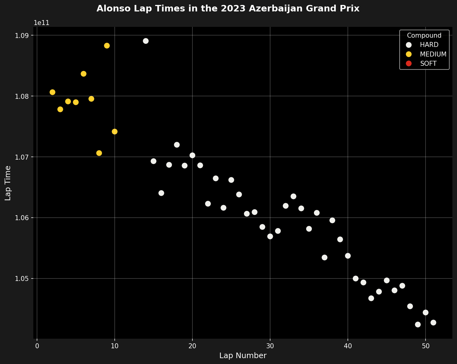
Make a scatter plot using lap number as the x-axis and lap time as the y-axis. Marker colors correspond to the tire compounds used.Enhance the Plot
Improve the appearance and readability of the plot.Parameters
The native function exposes the same filters as parameters.drivers selects the drivers to plot: a single driver for the view above, or several. laptime_cutoff removes slow laps. include_deleted keeps deleted laps when True:
Complete Example
The whole workflow above is wrapped in a single native function:Analyzing Multiple Drivers
To compare several drivers, pass them all in thedrivers list. The native default is the top-3 finishers, so omitting drivers gives exactly the multi-driver view:
Insights from the Visualization
This type of plot reveals several insights:- Tire Performance: Different compounds show distinct lap time clusters
- Degradation: Upward trends within a compound indicate tire wear
- Consistency: Tight clustering shows consistent driving
- Strategy: Compound changes and their timing are clearly visible
- Outliers: Slow laps (traffic, mistakes) stand out immediately
Customization Options
Customize the plot further:Summary
This tutorial shows how to create a lap time visualization. The plot combines temporal data (lap number), performance data (lap time), and strategic information (tire compound). The scatter plot format shows patterns, outliers, and strategic decisions clearly throughout a race.Related Pages
Tire Strategy
Detailed tire analysis.
Race Pace Analysis
Compare race pace.
Plotting API
Plotting reference.
Complete Race Analysis
Full race workflow.