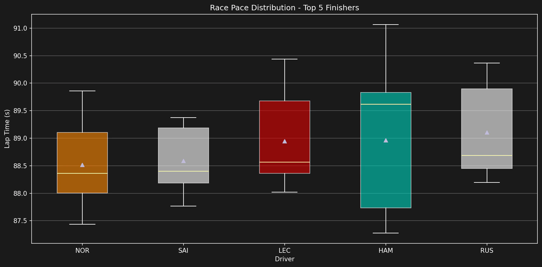
Race pace analysis is a common task in F1 data science. The analysis examines lap times over a long stint. The results show which driver is faster and how well each driver manages the tires.
This example uses the 2024 Abu Dhabi Grand Prix. Use the polars lib for faster filtering.
import tif1import matplotlib.pyplot as pltimport seaborn as sns# Load the session with polars libsession = tif1.get_session(2024, "Abu Dhabi Grand Prix", "Race", lib="polars")laps = session.laps
# Convert to pandas for easier plottingdf = laps.to_pandas()# Filter out very slow laps and pit laps# Typically, race laps are within a certain rangeclean_laps = df[ (df["LapTime"] < df["LapTime"].min() * 1.07) & # Within 7% of fastest lap (df["PitInTime"].isna()) & (df["PitOutTime"].isna()) & (df["LapNumber"] > 1)]
# Filter for specific driversdrivers = ["VER", "LEC"]comparison_df = clean_laps[clean_laps["Driver"].isin(drivers)]# Create a boxplot to see distribution of lap timesplt.figure(figsize=(10, 6))sns.boxplot(x="Driver", y="LapTime", data=comparison_df, palette="viridis")plt.title("Race Pace Comparison: VER vs LEC")plt.ylabel("Lap Time (s)")plt.show()