

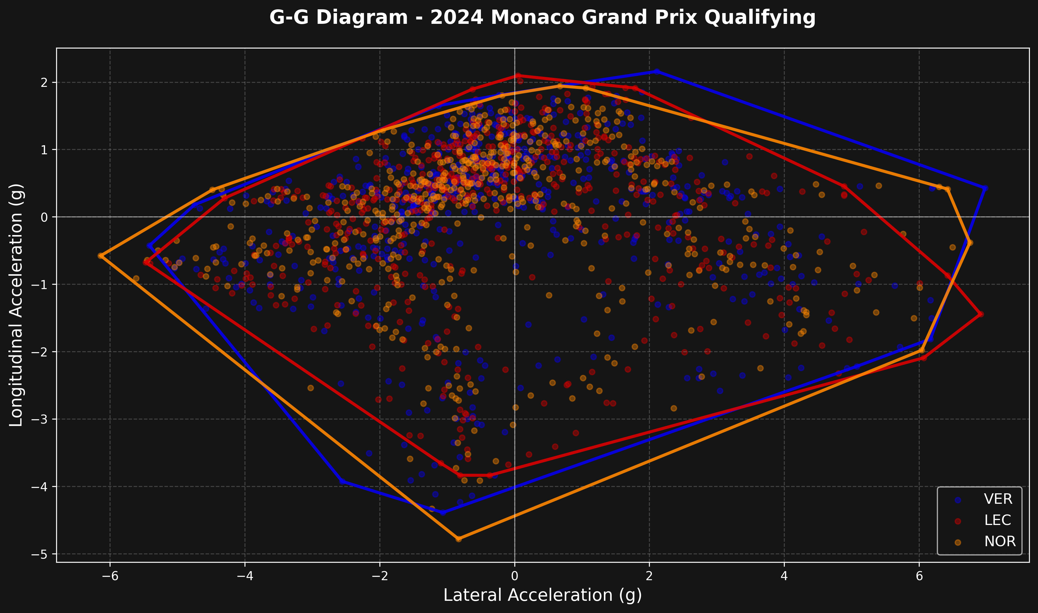
The G-G Diagram
The G-G diagram shows:- X-axis: Lateral acceleration (cornering forces)
- Y-axis: Longitudinal acceleration (braking and accelerating forces)
- Each point represents a moment in time during the lap
- The outer boundary shows the car’s performance limit
Load Session and Get Telemetry
Compare multiple drivers at Monaco Qualifying.Compute Accelerations
Calculate g-forces from telemetry data using smooth derivatives to reduce noise.The
smooth_derivative() function uses a low-noise differentiator algorithm that reduces noise in the acceleration calculations. Raw numerical derivatives amplify telemetry noise and create unrealistic spikes in the G-G diagram.Create a G-G Diagram
Plot acceleration data with performance envelope using convex hull.The performance envelope is computed using
scipy.spatial.ConvexHull, which finds the smallest convex polygon that contains all acceleration points. This accurately represents the car’s performance limits across all directions of acceleration.Parameters
The native chart accepts the shared filters. Pick the drivers with thedrivers list; the default is the top-3 finishers:
Complete Example
The whole workflow above (smooth derivatives, angle normalization, convex hull) is wrapped in a single native function:smooth_derivative and compute_accelerations helpers above live in the library under tif1.charts._acceleration. The telemetry comparison chart shares these helpers.
Reading the Diagram
Key insights from a G-G diagram:- Top of envelope (positive Y): Maximum acceleration
- Bottom of envelope (negative Y): Maximum braking
- Left and right edges (X): Maximum cornering forces
- Corners of envelope: Braking or acceleration combined with cornering
- Wider envelope: More grip available
- Rounder envelope: Better balanced car
Comparing Drivers
Look for:- Envelope size: A larger envelope shows more grip in use
- Envelope shape: Asymmetry shows car balance issues
- Point density: Where drivers spend most time
- Peak values: Maximum g-forces achieved
Track Characteristics
Different tracks produce different shapes:- Monaco: Smaller envelope, lower speeds, less extreme forces
- Monza: Larger longitudinal values (high-speed braking)
- Silverstone: Large lateral values (high-speed corners)