

Setup
Load Session and Get Lap Data
Calculate Time Deltas
Convert lap times to seconds and calculate the difference for each lap.Color Code by Faster Driver
Assign colors based on which driver was faster on each lap.Create the Bar Chart
Visualize the deltas with a bar chart where bar height shows the time difference.Add Legend and Styling
Complete Example
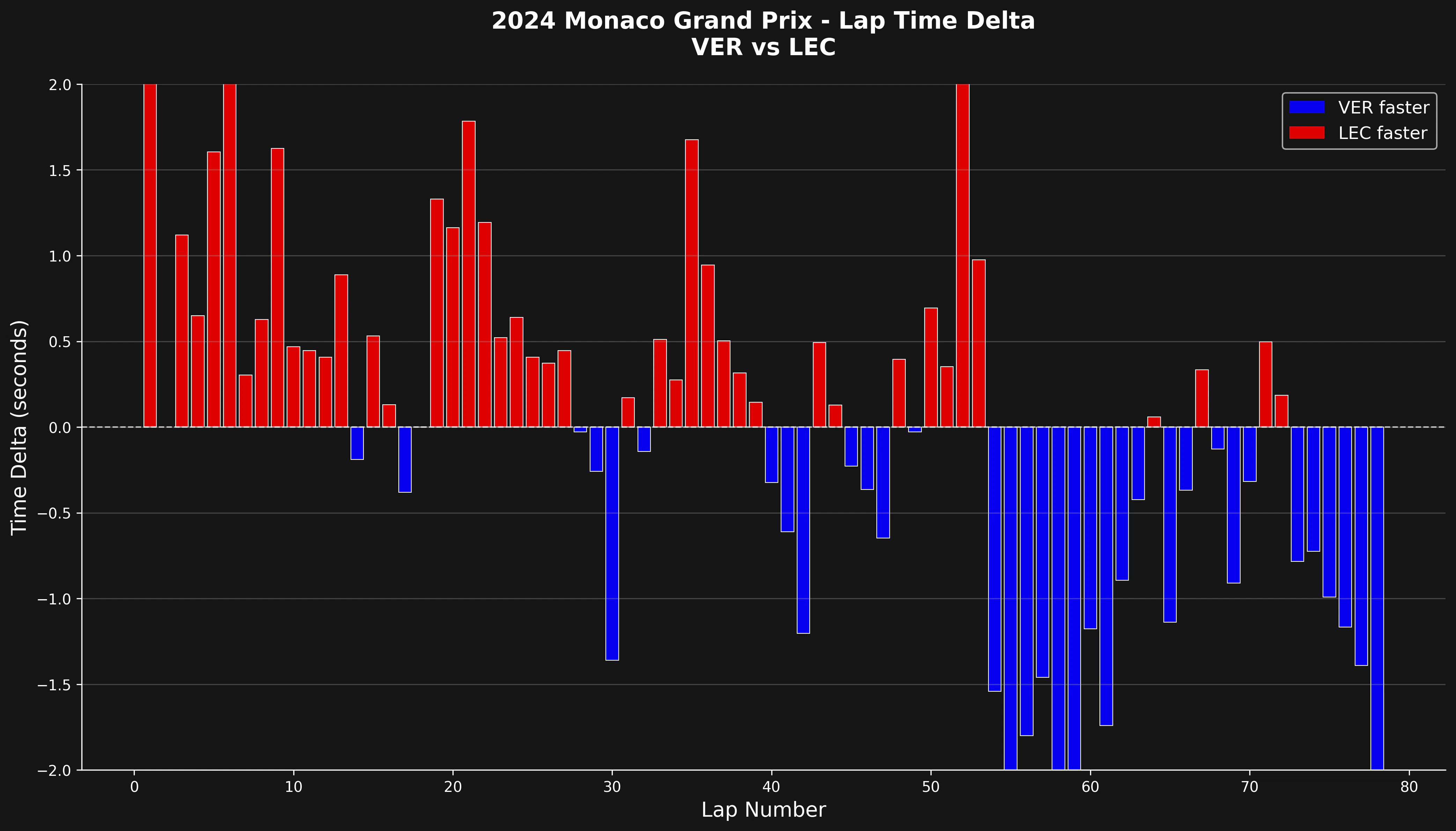
The whole workflow above is wrapped in a single native function:(-2, 2) used above. Bars are colored with the faster driver’s team color.
Interpreting the Chart
- Bars above zero: Driver 2 was faster on that lap
- Bars below zero: Driver 1 was faster on that lap
- Bar height: Magnitude of the time difference in seconds
- Color coding: The bar color identifies the faster driver
What to Look For
This visualization helps identify:- Consistency: Who maintains more consistent lap times?
- Pace trends: Does one driver get faster or slower as the race progresses?
- Tire degradation: Increasing deltas may indicate tire wear
- Strategy impact: How do pit stops affect relative performance?
- Traffic effects: Sudden spikes often indicate traffic or incidents
Filtering Out Outliers
The native function exposes the same filters as parameters. Drop pit laps withinclude_pit_laps=False (the default) and remove safety-car laps with a per-driver laptime_cutoff:
laps parameter, for example laps=[10, 11, 12].
Comparing Multiple Driver Pairs
To compare different pairs, call the native function with a differentdrivers list:
Summary
Lap delta comparisons give a clear, lap-by-lap view of relative performance between drivers. The chart shows patterns, consistency differences, and the effect of race events on driver performance.Related Pages
Driver Lap Times
Individual driver analysis.
Telemetry Comparison
Detailed telemetry analysis.
Race Pace Analysis
Compare race pace.
Position Changes
Track position changes.