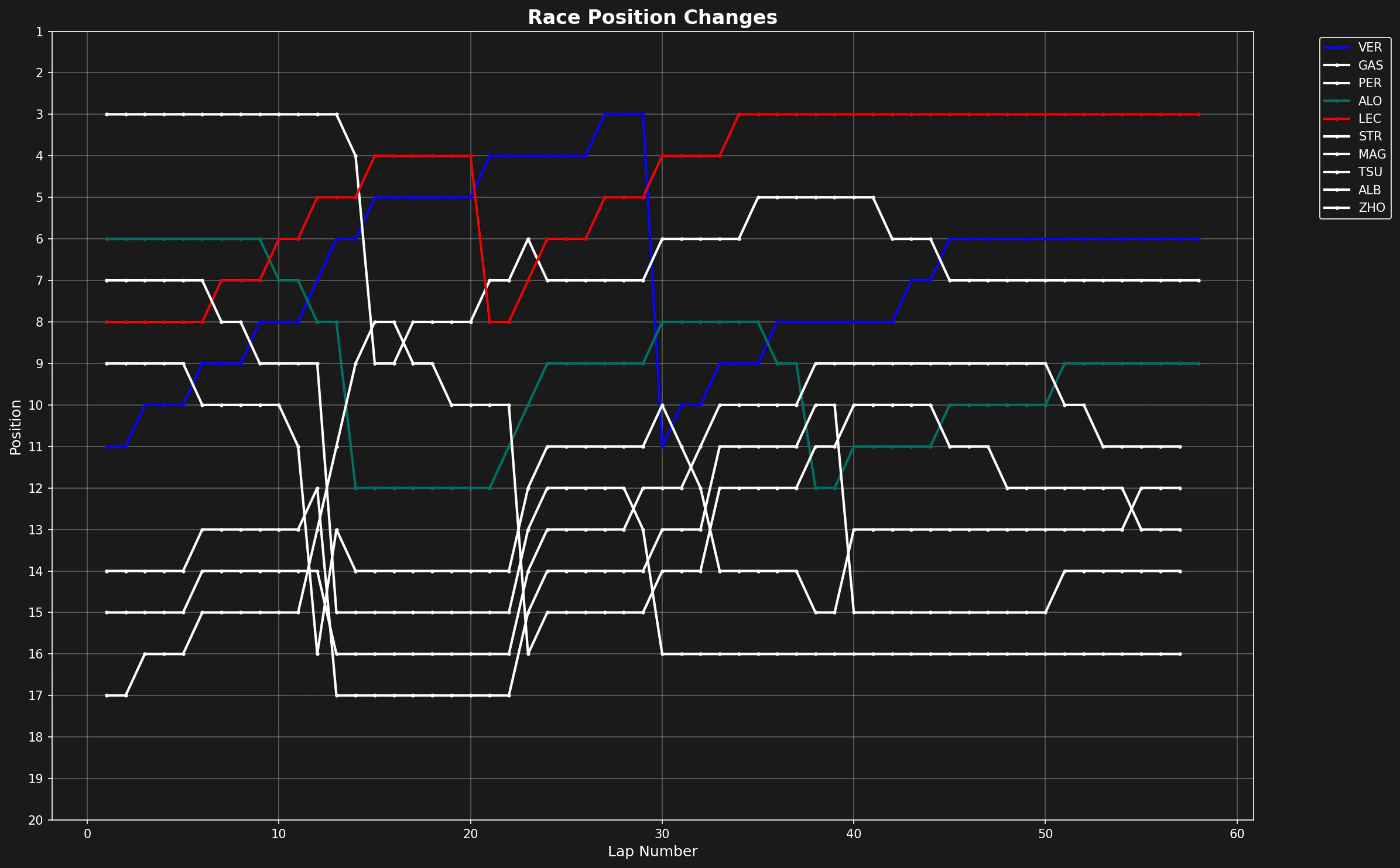
Visualize how driver positions evolve throughout a race
Position changes during a race show race strategy, overtaking opportunities, and driver performance. This tutorial shows how to create a position chart. The chart tracks every driver’s position lap by lap.
Plot each driver’s position against lap number. Use driver-specific colors to make the chart readable.
# Setup plotting with F1 themetif1.plotting.setup_mpl(mpl_timedelta_support=False, color_scheme="fastf1")# Create the figurefig, ax = plt.subplots(figsize=(8.0, 4.9))# Plot each driver's position over the racefor drv in laps["Driver"].unique(): drv_laps = laps[laps["Driver"] == drv] # Get driver abbreviation and color abb = drv_laps["Driver"].iloc[0] color = tif1.plotting.get_driver_color(identifier=abb, session=session) # Plot position vs lap number ax.plot(drv_laps["LapNumber"], drv_laps["Position"], label=abb, color=color)
Invert the y-axis so position 1 is at the top. Add the appropriate labels.
# Configure axesax.set_ylim([20.5, 0.5]) # Invert so P1 is at topax.set_yticks([1, 5, 10, 15, 20])ax.set_xlabel("Lap")ax.set_ylabel("Position")# Add legend outside plot area to avoid clutterax.legend(bbox_to_anchor=(1.0, 1.02))plt.tight_layout()plt.show()
The whole workflow above is wrapped in a single native function:
import tif1import matplotlib.pyplot as plt# One call: loads the race and plots every driver's position lap by lapfig, ax = tif1.plot_position_changes(2023, 1, "R")plt.show()# Or save straight to a file# tif1.plot_position_changes(2023, 1, "R", save_path="race_position_changes.png")
Position change charts show the strategic decisions, on-track battles, and performance trends of a race. Combined with tire strategy and pace analysis, they give a complete picture of race dynamics.