

Overview
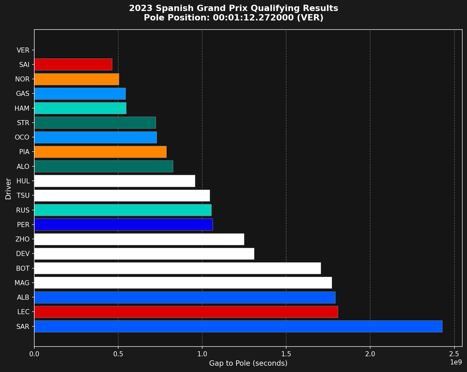
The qualifying results chart is a horizontal bar chart that shows:- Each driver’s position in qualifying order (fastest at top)
- Gap to pole position in seconds
- Team colors for visual identification
- Clear pole position reference
Loading the Data
First, load the qualifying session and get all drivers’ fastest laps.Getting Fastest Laps per Driver
Extract each driver’s fastest lap from the session.Calculating Gap to Pole
The chart shows time differences from pole position, not absolute lap times.Getting Team Colors
Use the tif1 color mapping to get official team colors.Creating the Visualization
Build a horizontal bar chart with proper formatting.Parameters
The native function exposes the shared filters.n_drivers keeps only the top-N finishers. include_deleted controls whether deleted laps count toward a driver’s best. The default False exists because a deleted lap can never win pole:
Complete Example
The whole workflow above is wrapped in a single native function:Customization Options
To show only the top 10, usen_drivers=10 (shown in the Parameters section). For value labels or highlighted drivers, style the returned ax after the call:
Comparing Multiple Sessions
Create side-by-side comparisons of different qualifying sessions:Exporting the Chart
Save the visualization for reports or presentations:Key Insights from the Chart
Use this visualization to identify:- Pole position and front row starters
- Gaps between drivers and teams
- Team performance clusters
- Drivers who significantly outperformed or underperformed
- Q1/Q2 elimination cutoffs (positions 16-20, 11-15)
Summary
The qualifying results chart shows the competitive order and the performance gaps in qualifying. Team colors and gaps to pole make patterns and driver comparisons clear.Related Pages
Qualifying Analysis
A detailed examination of qualifying data.
Driver Lap Times
Analyze lap time progression.
Data Visualization
More visualization techniques.
Plotting API
Plotting functions reference.